Project Description
Registry Insights
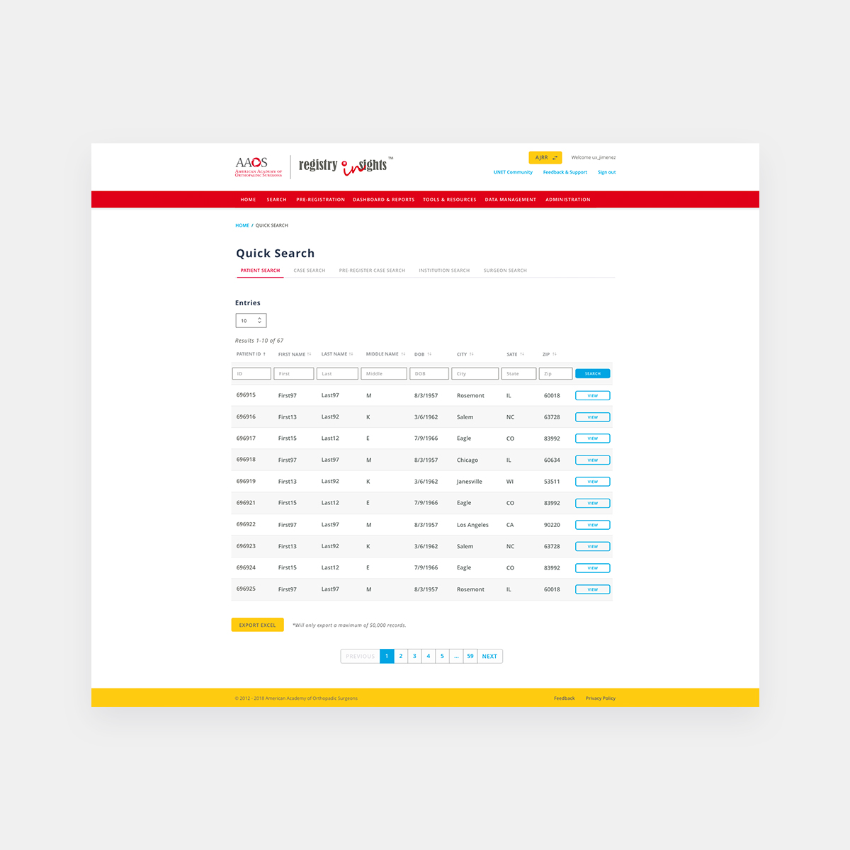
AAOS Registries are built on technology that allows your facility access to all of your AAOS-enrolled orthopaedic registries in one place. Subscribers can use the AAOS RegistryInsights® platform to run standard reports and use the dashboards to compare their institution to national benchmarks. In addition to procedural data dashboards, RegistryInsights offers a portal for the implementation and reporting of patient surveys. An added benefit is the ability to view issues with the files your institution uploaded, allowing for more accurate and relevant data in the Registry. And best of all, you can get access to your data within 48 hours of submission.
Challenges
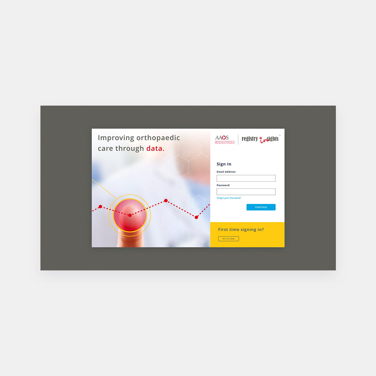
New Registry users faced significant challenges with the application, encountering numerous friction points right from the start. Through interviews, we identified issues such as the obscurity of the account creation process and the overwhelming amount of information required for login. To address these issues, I proposed a “lazy login”, hypothesizing that simplifying the initial information presented would expedite user access to the site. I quickly prototyped a new user flow and presented it to product and business owners.
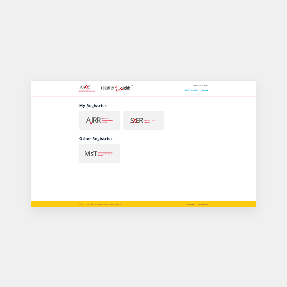
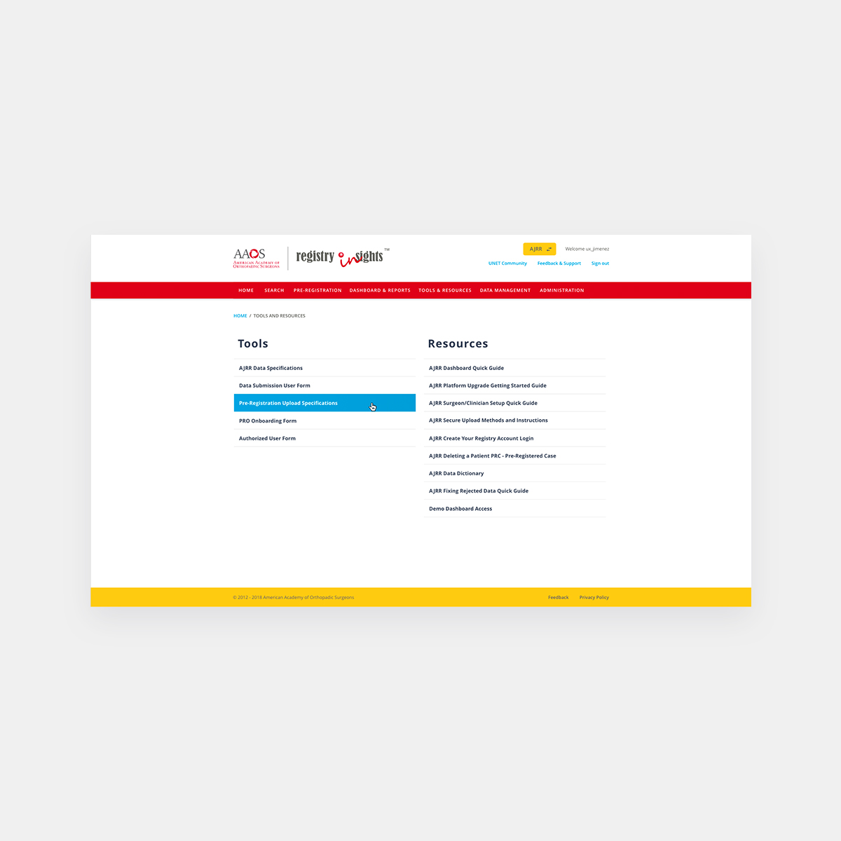
In addition to streamlining login, several valuable features were introduced. A critical business requirement was to allow users to select which Registry they wanted to access, especially with new Registries being added rapidly.
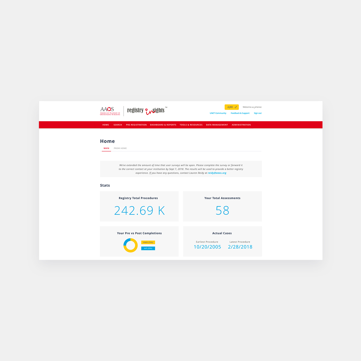
Once users entered a specific Registry, I ensured they could easily navigate back to the selection page by implementing a prominent yellow button in the header, which was validated through internal usability testing for its effectiveness in improving navigation speed.
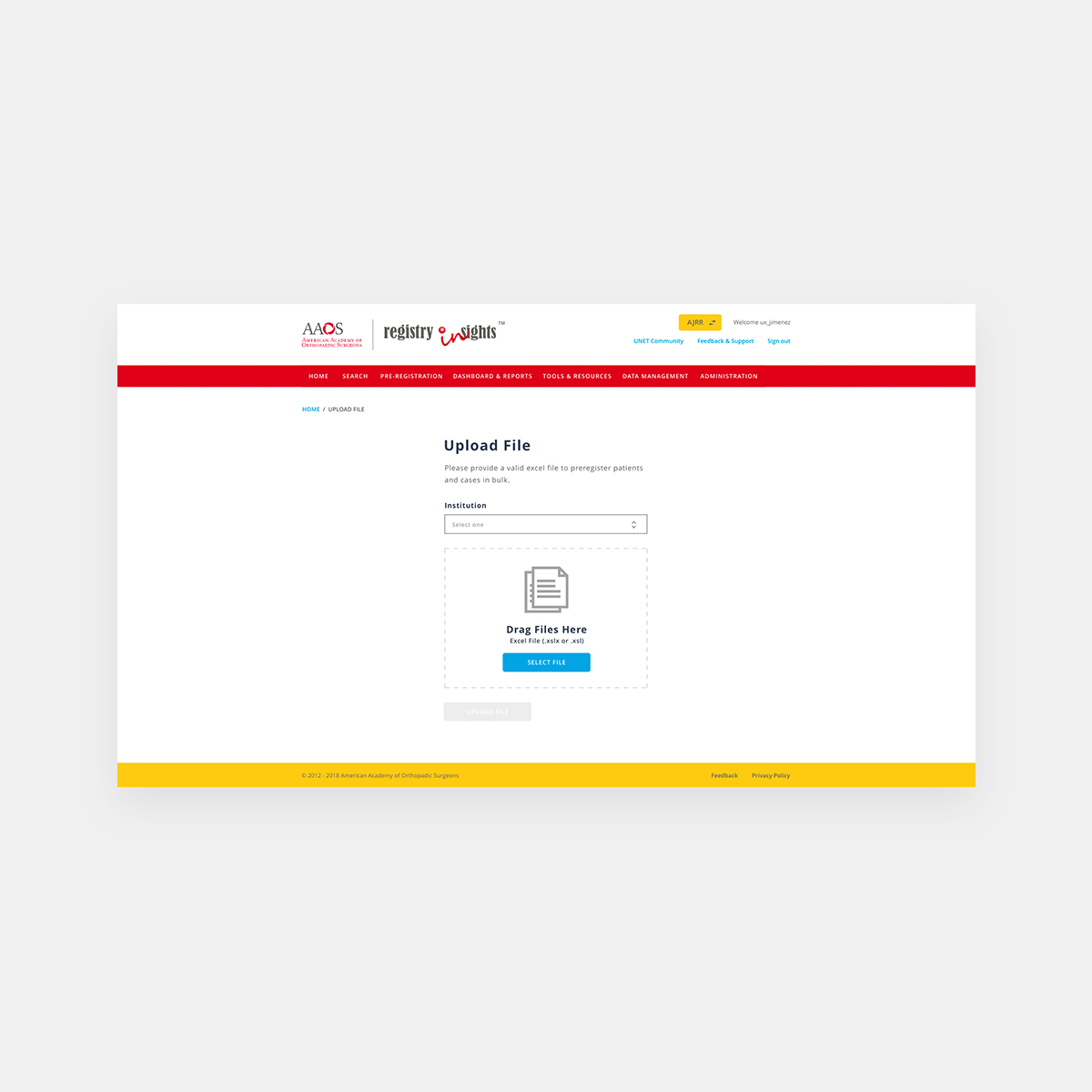
Previously, the Registry’s form-filling process was outdated. Following research on best practices, I opted for a single-column form layout that enhanced user efficiency and mobile-friendliness. I grouped fields logically and incorporated a drag-and-drop file upload feature.
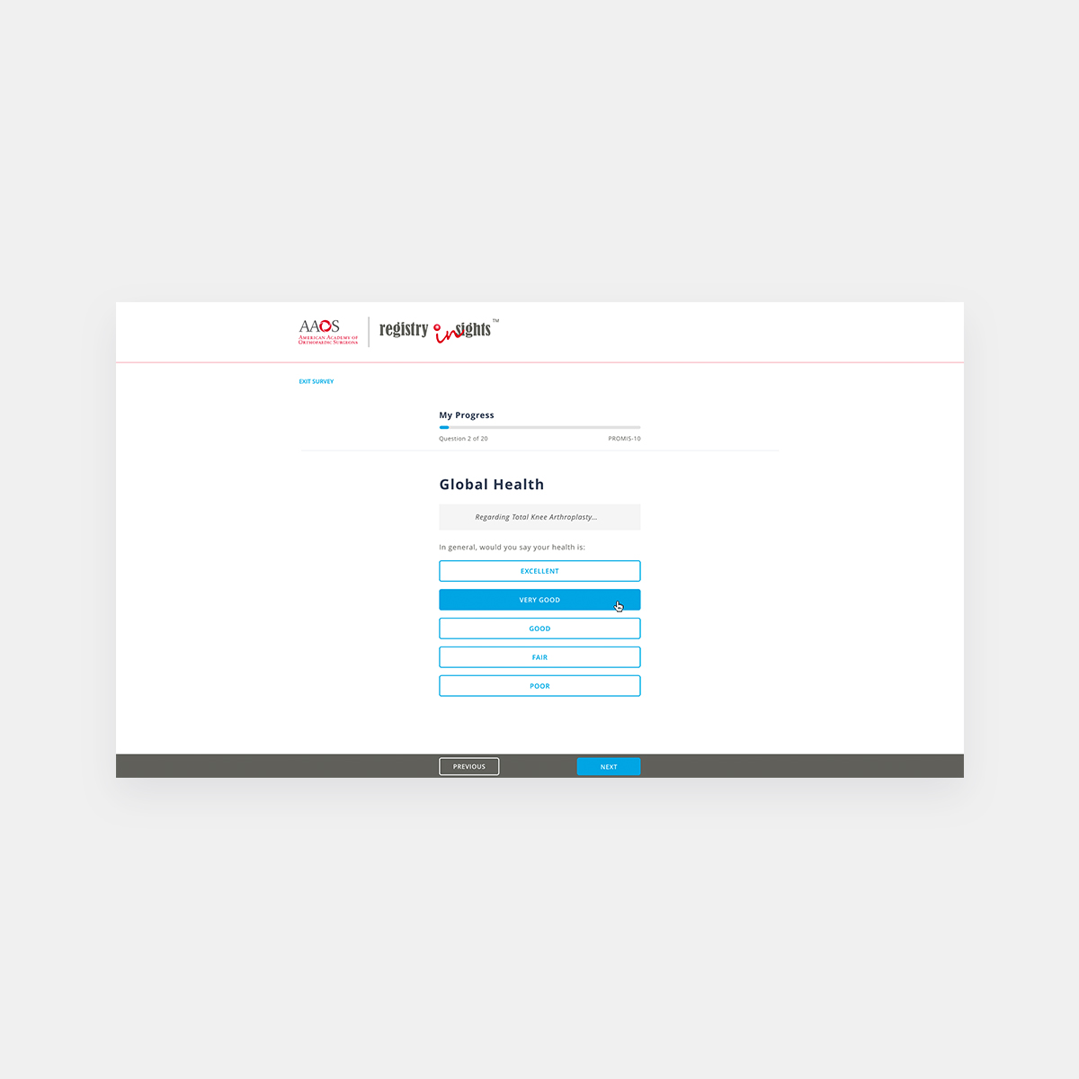
To streamline patient surveys, particularly for preoperative and postoperative assessments, I integrated a kiosk mode option accessible on the desktop site. To address user progress pain points and button accessibility, I introduced a progress bar at the top of the page and ensured that navigation controls remained fixed at the bottom of the browser window.
Following deployment of the new design, user engagement increased by 30%, accompanied by positive feedback on both visual design and user experience. This project exemplified successful collaboration and effective design solutions that significantly enhanced usability and user satisfaction within the Registry application.

