Project Description
Lock Card
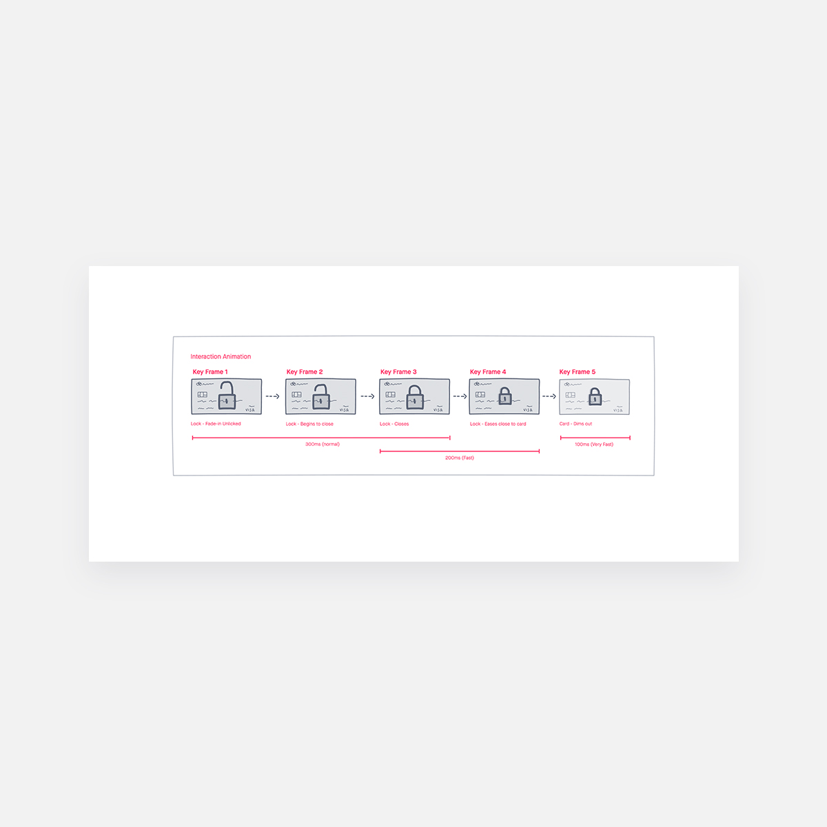
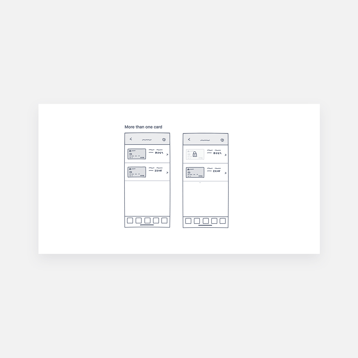
The lock card feature allows mobile app users to lock their debit or credit card at any moment.
Challenges
The objective of this project was to address several key business questions, such as understanding how users interact with the card lock feature on the mobile app. Questions included whether users preferred accessing the feature via the menu icon on the home screen or through quick links.
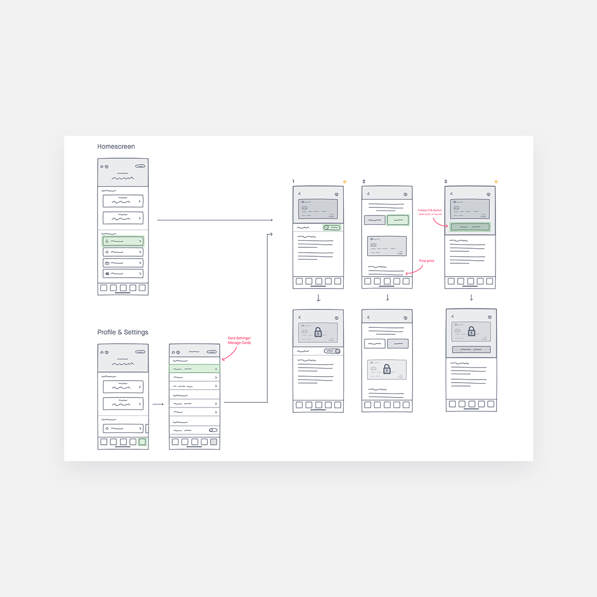
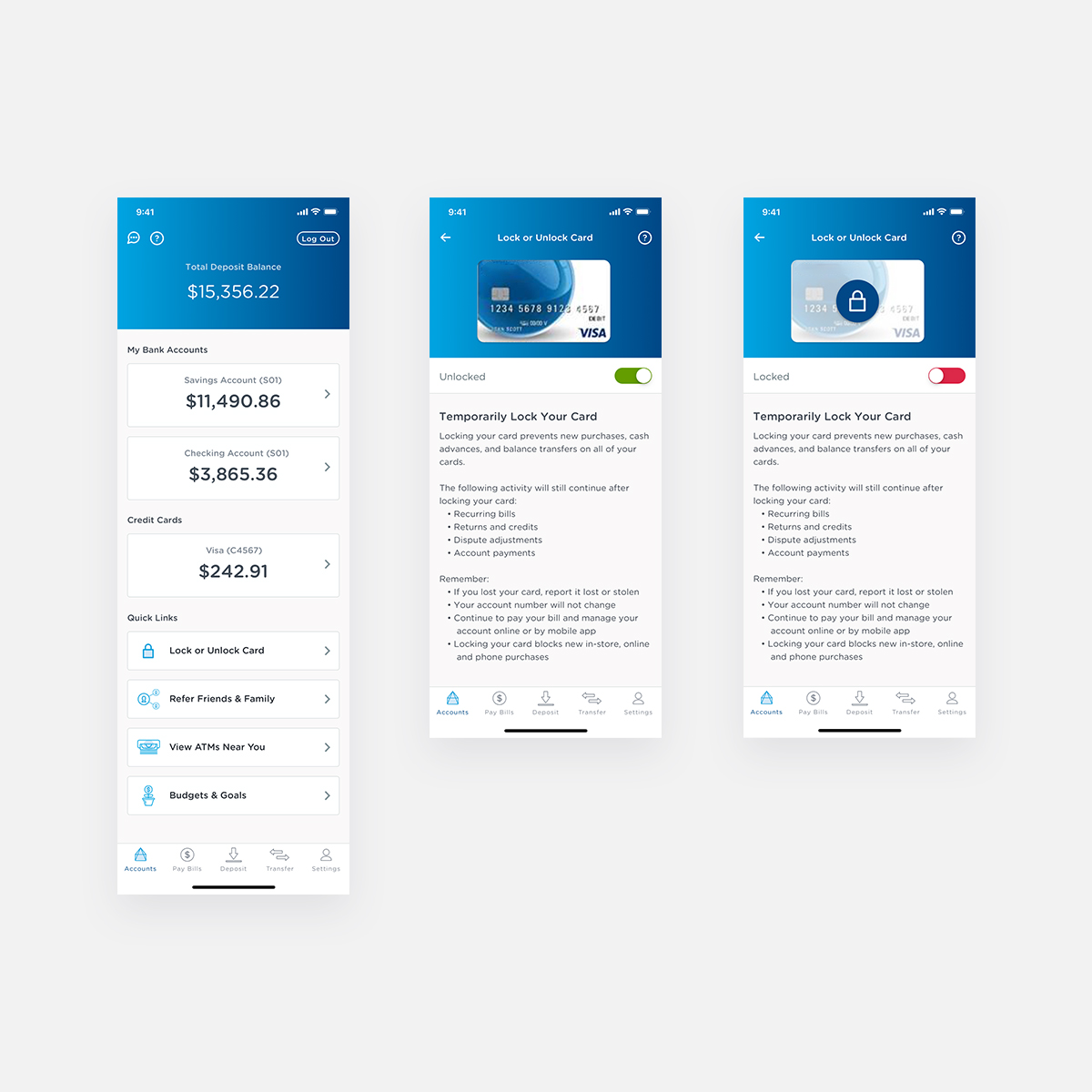
Drawing insights from competitive analysis of similar apps, I proposed a fail-safe design allowing users to lock their cards in just three clicks directly from the home screen. This approach, identified as efficient during our research, received unanimous support from the team and was subsequently tested through UsabilityHub.
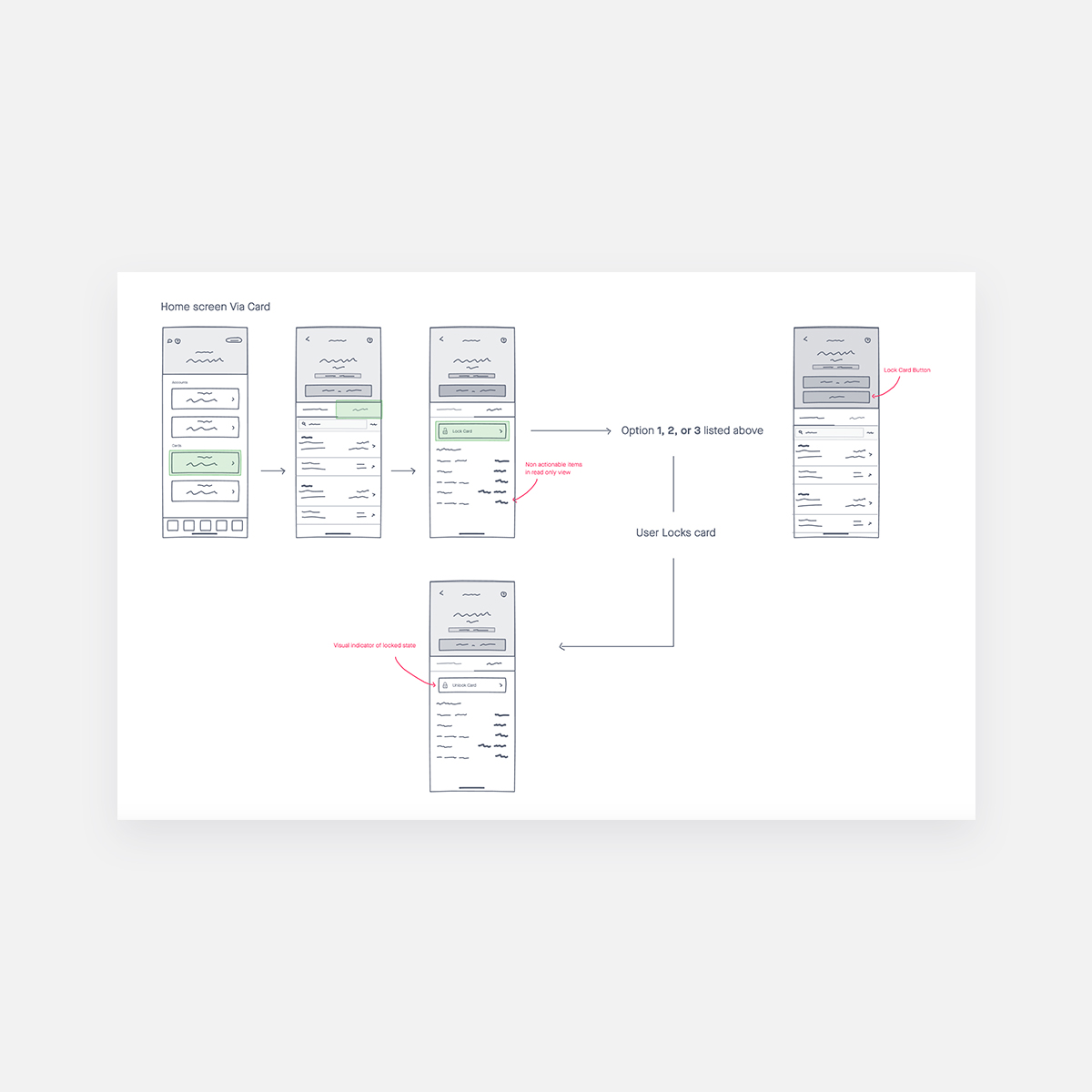
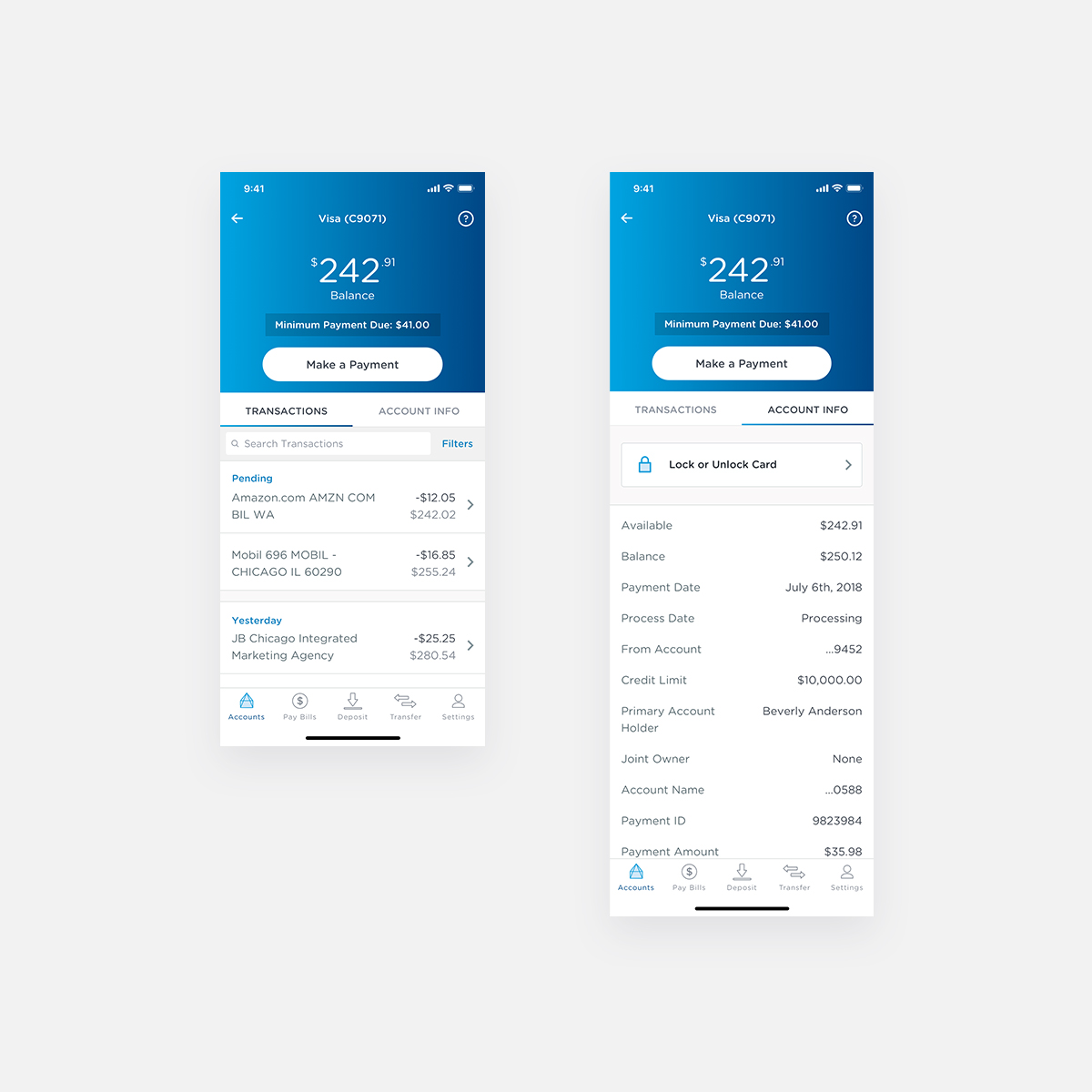
During testing, we explored additional pathways for accessing the feature, ensuring flexibility without limiting users to a single method. One alternative involved accessing the lock feature by tapping on the card from the home screen and navigating from there.
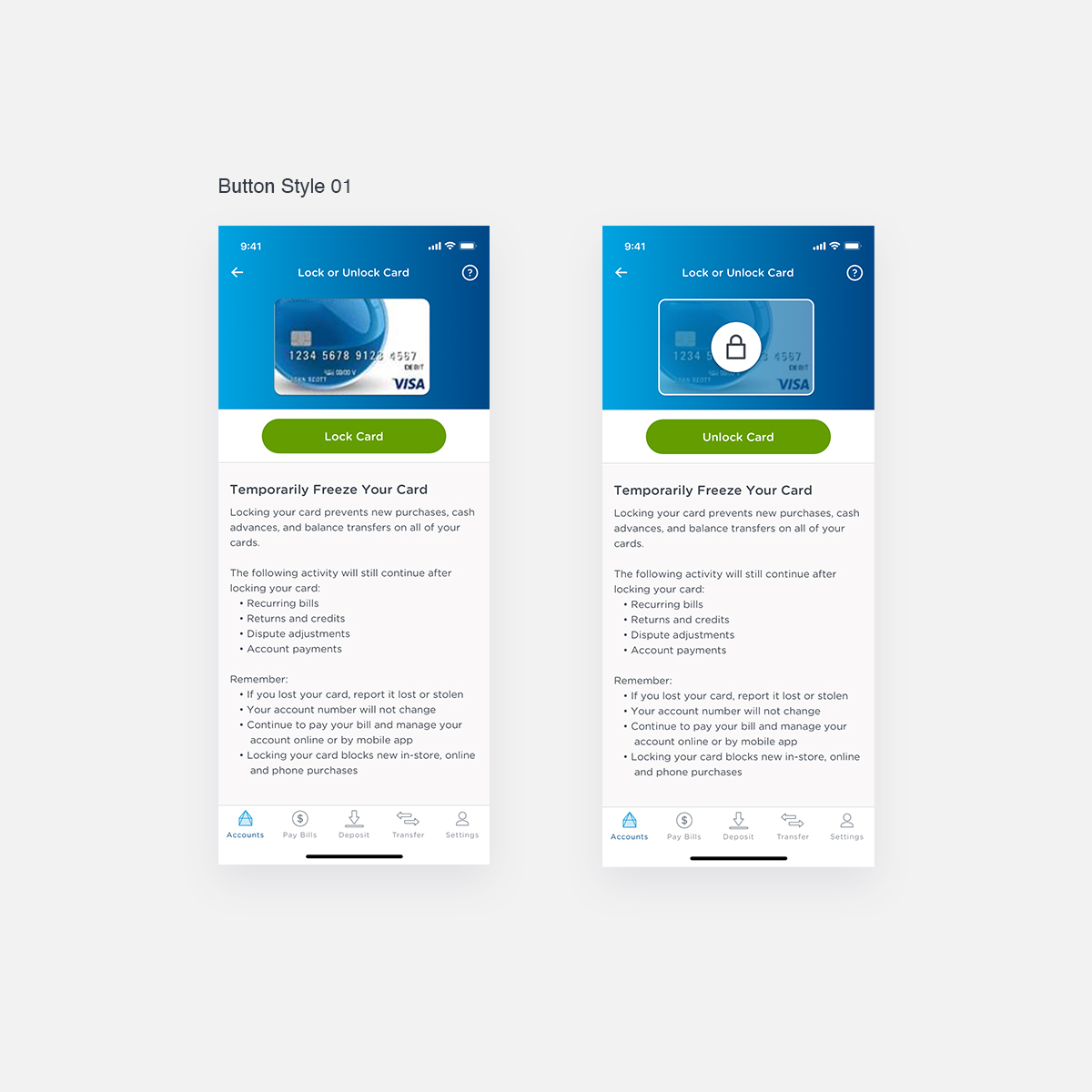
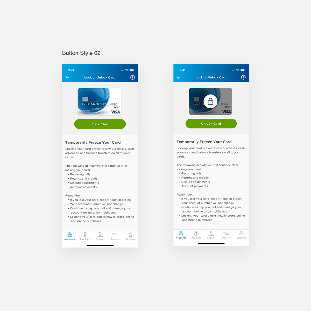
To refine the visual design, we tested variations using different components from our design system. A preference test was conducted to gauge user sentiment, comparing a traditional toggle design against a button interface.
Following the prototyping phase, we conducted user testing to validate the effectiveness of our preferred design. Users successfully completed tasks as anticipated. The subsequent preference test revealed that 64% of users preferred the toggle interface over the button.
Based on these findings, our team made recommendations to standardize the term “Lock” instead of “Freeze” and to maintain both pathways to access the card lock feature. Overall, the project concluded successfully, meeting our objectives and providing valuable insights into user preferences and usability.

