Project Description
Code-X
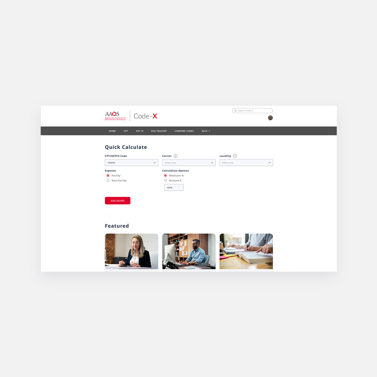
Orthopaedic Code-X saves you time, reduces errors, and provides quick access to all the data and functions you need to code and use ICD-10 with confidence. Navigate and integrate the following with incredible speed, accuracy, and ease.
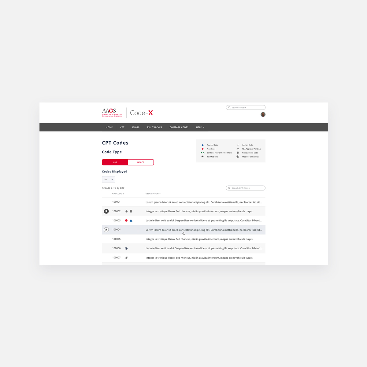
- 2019 Current Procedural Terminology (CPT®) codes and cross-references for musculoskeletal, integumentary, neurologic, and radiology procedures
- 2019 ICD-10-CM codes and cross-references including V-codes
- 2019 AAOS Global Service Data guidelines featuring specific and detailed inclusions and exclusions and the global billing period for each CPT® code
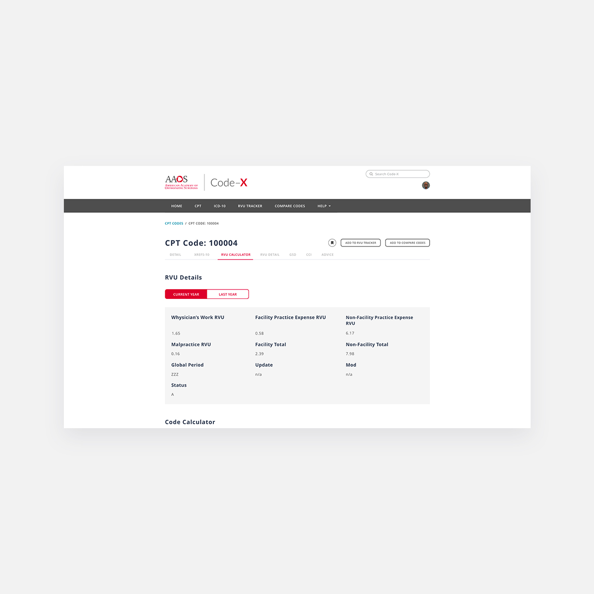
- 2019 Medicare Relative Value Units (RVUs) and conversion factors
- 2019 HCPCS codes with two search paths to the data
Challenges
Code-X has always been a product that seemed daunting to me. I want to express my gratitude to the exceptional team of knowledgeable individuals who helped me navigate the intricacies of coding orthopedic procedures. The primary objective of this project was to enhance the user experience in response to customer feedback. Our team included product owners from Online Learning and IS.
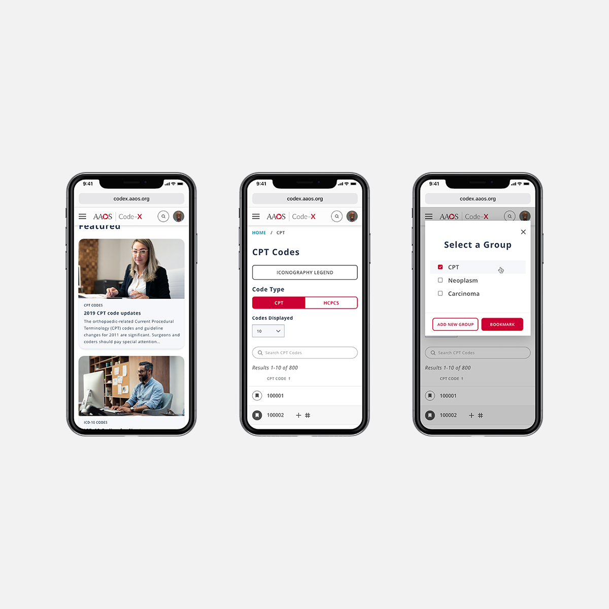
Feedback from our listening posts indicated that members wanted Code-X to evolve into a more contemporary platform. Instead of releasing the new 2020 Code-X as a downloadable program for local installation, we transitioned it to the cloud. This move allows users to access the platform online from any device, benefiting from the upgraded user interface provided by the Canopy Design System—a long-overdue visual refresh.
The previous version of Code-X required users to open new windows within the application to search for codes. Clicking on the CPT option in the navigation would repeatedly open new windows, intended to facilitate comparison of multiple codes. However, this approach often led to users unintentionally accumulating numerous tabs, causing clutter and confusion.
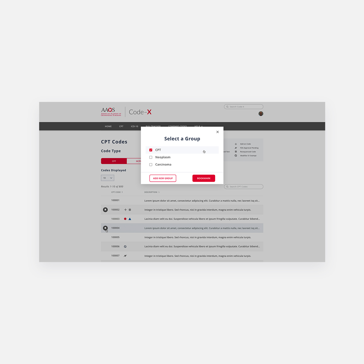
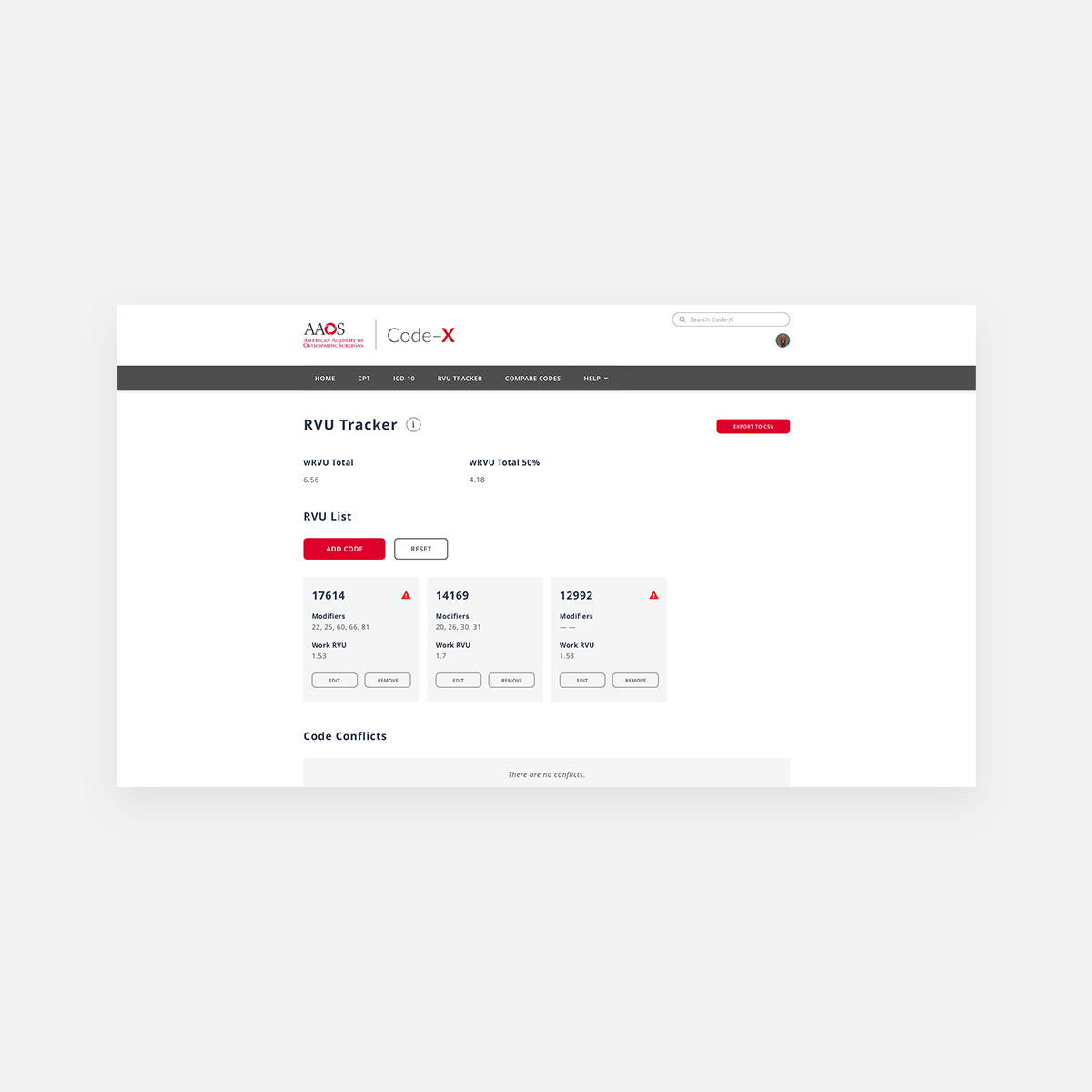
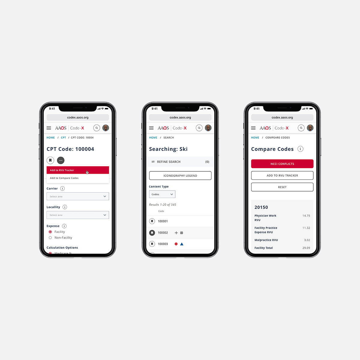
To address this issue, I researched and drew inspiration from e-commerce sites that use side-by-side product comparison pages. This approach resonated with me, and I implemented it. Now, instead of opening multiple windows, users can easily find a code and add it to a comparison list with a single click. Codes are added in the order they are selected, allowing users to manage and modify their selections efficiently. I prototyped this flow quickly and conducted remote moderated usability tests via LookBack, which yielded positive results—members were able to adapt to and utilize the new UI effectively.
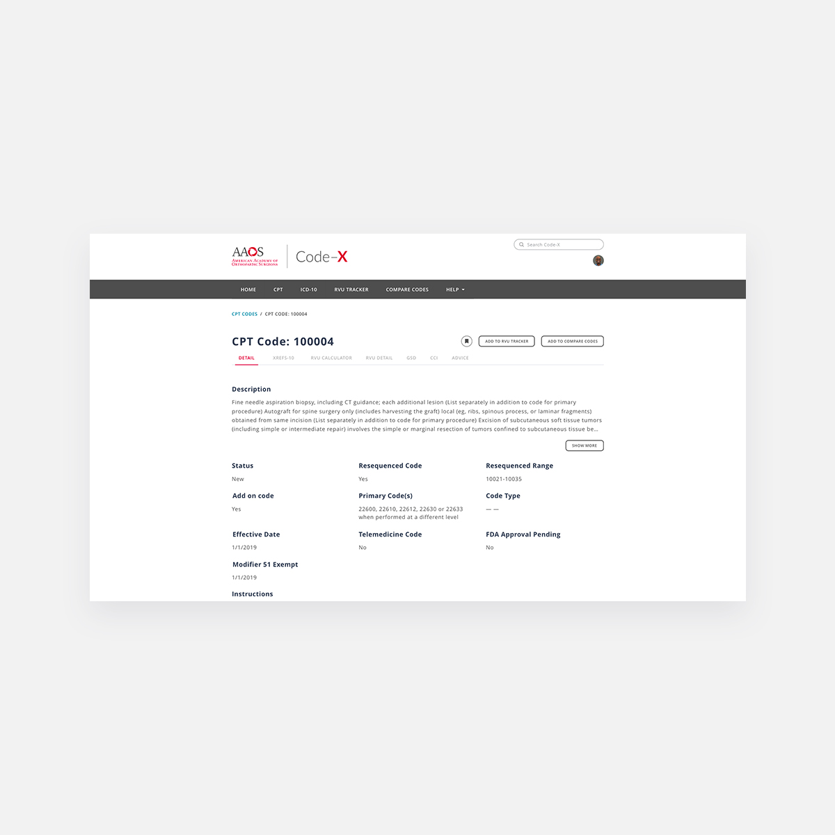
Much of the content within the code detail view needed to be presented in an easy-to-digest format. This was challenging due to the decentralized knowledge about the product, requiring me to gather information from multiple individuals across different departments. Reflecting on this process, I realized that establishing a dedicated communication space on Slack would have expedited information sharing and collaboration.
Overall, this project not only modernized Code-X but also significantly improved its usability, aligning it with user expectations and enhancing their satisfaction with the application.

